The idea behind this was to give the logo a fresh, and more urban look. The original logo was a bear, and when I received that logo, it was a low res raster image.
Second Draft
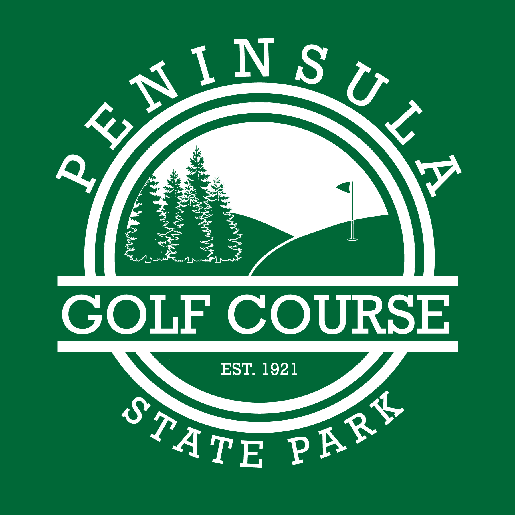
This is the redesign of the logo to the left. This is the one that I would have went with. Unfortunately, it was out of the clients price range to screen print. The solution was to get rid of colors.
Final Draft
The higher ups at Peninsula State Park decided to go with this logo. It resembles the originals, but it is only one color.